Shay Ruggles
Head of UX/UI
As Director of UX of Gravity Shay Ruggles ensures Gravity is creating compelling user experiences that balance user intent, client goals and site performance.
The Halo Effect is a social-psychology phenomenon that can affect your business positively or negatively. Learn how to use this phenomenon in your favor.
A large part of the user experience (UX) field is psychology – the science of behavior and mind, embracing all aspects of conscious and unconscious experience, as well as thought. It’s amazing to see the fight or flight, hunter-gathering history of our brains at work as we browse the web.
The halo effect is a cognitive bias in which an observer’s overall impression of a person, company, brand, or product influences the observer’s feelings and thoughts about that entity’s character or properties. The Halo Effect works by creating a shortcut in the brain and permits people to make an overall judgement based on an impression of one attribute.
As in “This person is nice! They must also be smart.” But, it also goes the other way… meaning if someone dislikes an aspect of something, they’ll have a negative predisposition towards everything about it.
As we conduct usability research, we see trends and we see the Halo Effect either serving a company positively or extremely detrimentally. I cannot stress enough, the importance the design, copy and usability your website has on your company’s overall brand.
Remember this quote?
_“Your brand isn’t what you say it is. It’s what they say it is.”_
– Marty Neumeier, ‘The Brand Gap’
Don’t think for a second that an annoying rotating banner, confusing copy or outdated/unattractive design will not impact a user’s impression of not only your website but your products, your customer service and your overall company. It can be hard to remember that your website is one of millions… and one of potentially hundreds a user sees in a day. People have no time to dig or wade through muck to get to what they want.

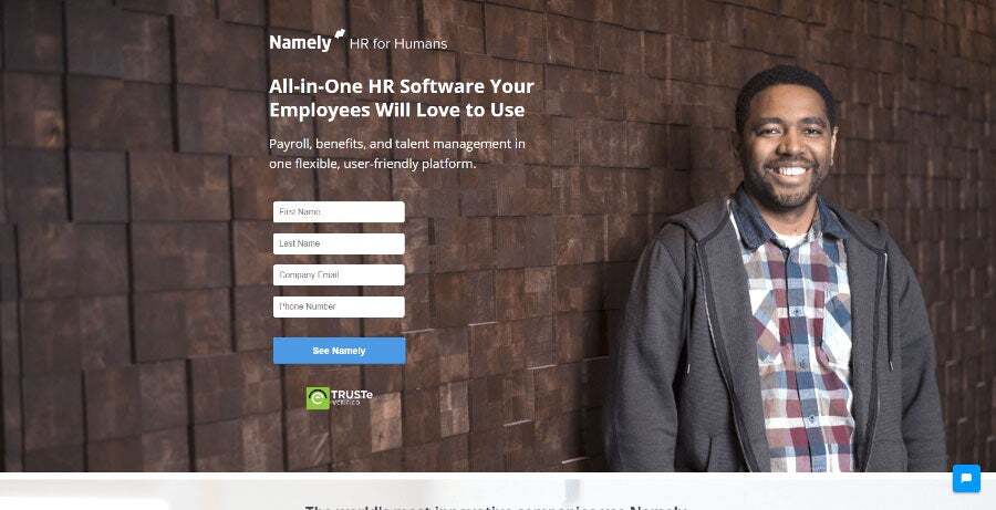
“XYZ Company is more geared towards me, this is “HR for Humans” but they’re addressing the employees. Looks like I can’t get in here till you put in my info here. What does ‘See Namely’ mean [clicks on the button and the form fields show errors].
_This sucks, this website sucks, this product sucks._
I have to put in all my info before I can even get there. So. Of course, I prefer XYZ Company because it has all the information at my fingertips, I’m not asked to fill out a form just to see it. I definitely prefer XYZ Company.”
This example landing page, plays by all the rules. There is a smiling person looking at the camera, displaying a warm and friendly face. The form fields are above the fold. They have seemingly good copy. But it’s all wrong. This is not what this user wants to see and she goes downhill faster than you can believe. But believe it! This is a real quote from a real usability test I conducted last week.

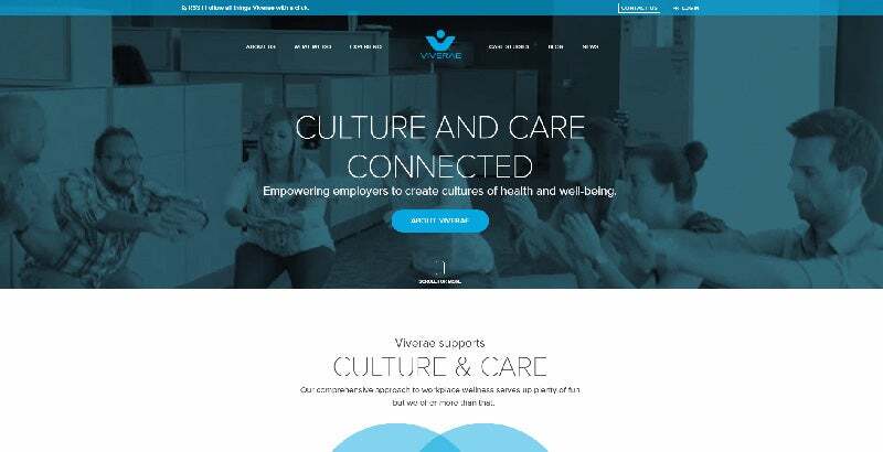
“This [Viverae] is more up to date, technology driven company. The videos here are exciting, there are people here actually doing workouts at their job. This company seems like it will be very hands-on and interactive that will really pull in the employees and create more of a wellness environment inside and outside the workplace.”

https://home.redbrickhealth.com/
“Right off the bat, with this initial home page [RedBrick], I feel I little more excited, I little more drawn in. For some reason, I feel like this site is going to be more innovative, up to date, they’re going to do more for us. The first one feels more dull and mainstream like, this is just another typical site… what are they actually going to do different than the average company like it. The second one has movement and pictures and real-live people that we’re already getting information from.“
For the sake of your business, we recommend testing your website and truly understanding what people think, say and do while using your website. Let the Halo Effect work in your favor by providing a pleasant user experience on your website.
Contact us to conduct a usability test on your website today. It’s only $5,000 so what do you have to lose… except more leads?