Is your site accessible to those with vision impairments? Follow these tips on accessibility guidelines to keep your site (and business) inclusive.
A website is one of the best marketing and sales tools your business will ever have – people can seek out and learn everything you want them to know about your business, products and services at any time, from almost anywhere. But if your site is inaccessible to the visually impaired, you are creating a barrier to a large audience of potential customers. And without the proper knowledge and willingness to take action, you could also be risking a lawsuit or federal action.
Let’s start with a broad overview of Web Accessibility. This is done by simply removing barriers that prevent interaction or access to websites by anyone with a disability. In order to include ALL potential clients or customers, sites should be correctly designed and developed to give all users equal access to the information and functionality being delivered.
But since no one wants their site to be all black text on a white background, how can you be sure you have appropriate website accessibility for those with vision impairment?
The Web Content Accessibility Guidelines (WCAG) are part of a series of guidelines published by the World Wide Web Consortium (W3C), the main international standards organization for the Internet. These guidelines are not law – YET – but do specify how to make content accessible for people with disabilities, as well as all user agents, which may include a mobile phone or email reading software. There are other guidelines as well but the WCAG is considered to be the standard to follow.

The acronym POUR is often used to identify the four key principles of being perceivable, operable, understandable and robust. There are testable criteria to check whether your site meets these principles, which include guidelines such as making text content readable and understandable, making all functionality accessible from a keyboard, and maximizing compatibility with current and future user agents, including assistive technologies.
All of this may sound like a lot of added work for design and development teams, but in reality, getting your site to WCAG Level AA standards is likely easier than you think if you are already following existing laws for legal documents (such as Privacy Policies and Terms and Conditions) and are using the best practices of SEO.
How does strong SEO help satisfy accessibility requirements? Simple. People who are visually impaired often use programs on their computers that read text to them. Those programs can easily read plain text, but things become much more difficult when there are links, images, and animations present – not unlike what happens behind the scenes with your favorite search engines. In order to follow the POUR principles, the following must apply to your site.
- Links: There should always be text inside of a link tag describing where the user will go once clicked.
- ALT Tags: Since we don’t have computers that can describe images like humans, it is important that all images have ALT tags containing descriptive information.
- Header Tags: Use header tags such as H1 or H2 to let the computer know it is a title rather than plain text and holds a stronger importance.
- Keyboard Navigation: A user should be able to navigate through a website using arrows and the tab key instead of solely with a mouse.
- Animations: A user should never have to rely on an animation/movement to access content on a website.
If those first few bullets don’t sound like something you’re already doing, please give our inbound team a call!
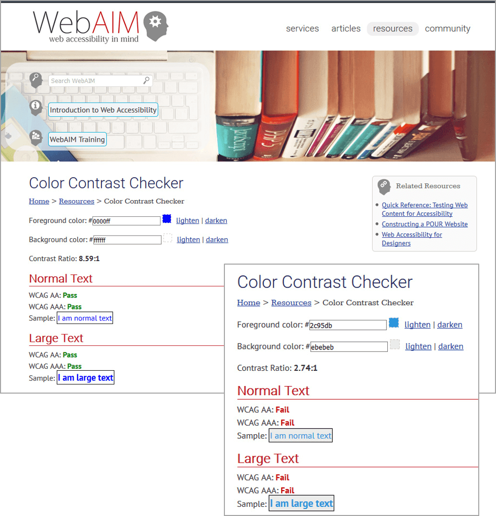
There are also helpful tools that help you determine whether your text size and color choices are WCAG compliant. Allowed colors are all about contrast ratios.
- Level AA requires a contrast ratio of 4.5:1 for normal text and 3:1 for large text.
- Level AAA requires a contrast ratio of 7:1 for normal text and 4.5:1 for large text.
If you aren’t a designer well-versed in contrast ratios, but want to check your existing or planned color schemes, never fear! There are online tools such as http://webaim.org/resources/contrastchecker that will calculate them for you when you input your text and background hex colors.

While you may not think it’s terribly important to meet these standards, think again. Some standards are required by law per the Americans with Disabilities Act (ADA) for ANY legal documents on a site, as well as for complete sites that are government-related. Even a school that receives federal grants are bound by these requirements - non-compliance could mean a loss of those federal dollars if the school’s site isn’t ADA compliant.
For non-government entities, aside from being a poor business decision to exclude and eliminate potential customers, the legal ramifications can also be heavy. For example, after years of not responding to requests to eliminate barriers, a class action lawsuit was filed in California against Target by the National Federation for the Blind on behalf of residents with vision impairment that could not access much of the retailer’s website. Target eventually agreed to pay $6M in class damages, as well as $3.7M in attorney’s fees and costs, and was monitored by the NFB to ensure full accessibility was achieved by a defined date.
Proposed website accessibility regulations for public accommodations under Title III of the ADA were expected to be released in April, 2016, but have been delayed by the Department of Justice until sometime in 2018. Stay tuned, we’ll be sure to identify what to watch for and how to be compliant when those regulations are solidified.
Share
Subscribe


