Situation before Gravity Global
Craig Hospital is a world-renowned rehabilitation hospital that exclusively specializes in neurorehabilitation and research for individuals with spinal cord and traumatic brain injuries. When a patient goes to Craig, they join a family. Craig is a space where patients not only receive best in class care but a place where patients and families are empowered in a fun and energetic way. Craig Hospital’s website wasn’t representing the character and world-class care a patient instantly recognizes upon arriving at the hospital. Patients often found it difficult to find programs and events, understand the admissions process, and determine what resources were available to them. In addition, the website was difficult to update and not optimized to support their extensive resource library.
Opportunity/Strategy
After reviewing the site’s usability and meeting with stakeholders, it was apparent we needed to do a better job of explaining who Craig Hospital is, make it easier for patients and caregivers to locate information, and most of all, allow patients and families to get a real taste of the Craig difference before they visit.

What we did
It’s all in the details! Gravity Global worked tirelessly to understand every program and determine audience preferences for navigation, content, and methods of contact.
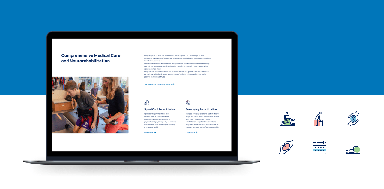
Gravity felt this was a significant opportunity for Craig Hospital to set themselves apart. The design team was committed to creating a trustworthy, energetic, and professional website with a carefully considered mega menu and custom iconography. Custom content was created to develop informative and inspiring descriptions for both patients and caregivers to enjoy and digest with ease.
We created north stars for how we wanted Craig Hospital to feel to website visitors.
They were important reference points throughout the design phase, along with the website goals and KPIs, and included:
- Empowering and Hopeful - It’s going to be hard work, but we’re here to empower you to get back home and living your life.
- Warm and Friendly - We’re true partners to you and your family. Once you’re at Craig, you’re always part of our family.
- Innovative and Cutting Edge - There is no canned approach to what we do. We’re using the latest techniques, technology, and research to ensure our patients have the best possible outcomes.
- We’ve got your back - We’re ready to go to bat for you, ensuring you get the time you need to heal at Craig. From talking to insurance companies to assisting you achieve your goals, we’re here for you.
Through researching competitors and the medical digital landscape, it was clear that the common themes of websites were sterile, overly clean to the point of being cold and impersonal, and used of a lot of straight hard lines.
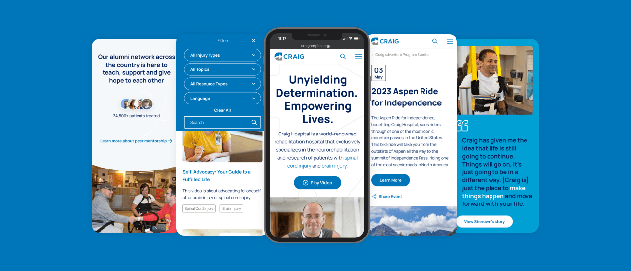
With the Craig site, we wanted to bring in the family feel that is one of their differentiators and humanize the experience. So, after diving into the existing brand guidelines, we leaned into the curves within the “C” of their logo mark. Using curved elements throughout the site, particularly differentiating between modules, softened the experience and brought in a more friendly feeling. By creating animations and transitions as the user moves through each page, the experience became more approachable and engaging, and provided a sense of movement to communicate what Craig is all about.
Utilizing more of the secondary color palette of Craig Hospitals brand -- the lighter blues and yellow, green and purple colors -- gives the website a warm and inviting feel, particularly compared to competitors who consistently revert back to the cold uninviting blue theme. It was important to bring in those secondary colors as the Craig Hospital brand does anchor itself with their solid blue brand color.
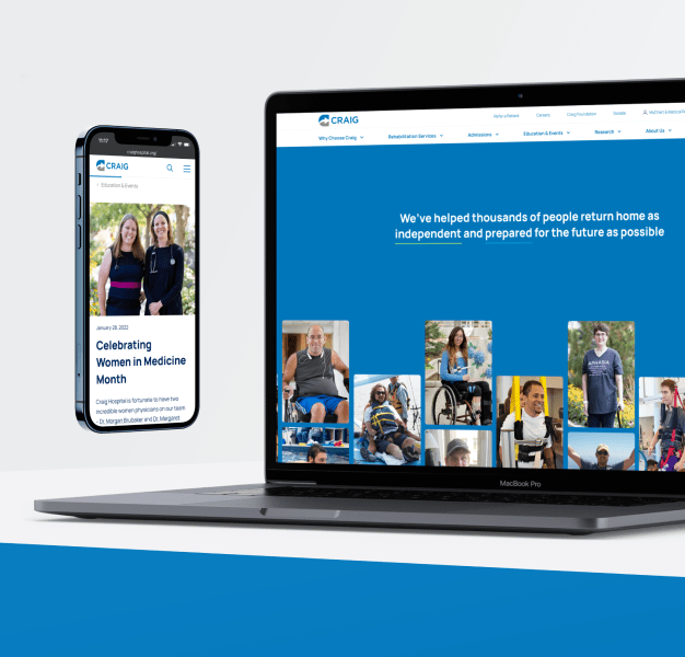
Another important aspect of the new design is highlighting more photography and video to bring real patients and staff to the forefront to convey the warmth, love and family-feel of Craig, and showcase the incredible environment they have created.


Immediate results
Increase in organic traffic for Craig Hospital
 1_20231117034647_0.svg)
Award winning website
Long Lasting Value
The new CMS is up and running. Patients and caregivers can now easily find information on programs, admissions, events, and a robust resource library. The new site content has created a dramatic increase in organic traffic and increased conversions due to the focused UX and design.
