Your website is unquestionably your most important marketing tool. It’s a business card, a CV, an invitation to do business. So if you rebuild your site and walk away, patting yourself on the back for a job well done – you’re doing it wrong!
Imagine… your new site is beautiful, you’ve got subtle background video, excellent work samples in your portfolio, interesting but professional copy, and the best design work your creative team or agency has ever done. It took a lot of blood, sweat and tears to get here, and you’re thrilled with the result. Take a moment to bask in the glory! And then, if you’re smart, get right back to work.
Sound crazy? Think about all the reasons you decided to undertake a redesign in the first place. Now consider whether those reasons came from your team or your customers, and honestly determine if you’ve truly addressed the problems with a large scale design change.
- If users reach your homepage and still do not know what your company offers and what they can do on your site, they leave
- If users get lost on your website, they leave
- If they are bombarded by “cool” design with little value, they leave
- If the information is hard to read or doesn’t answer their questions, they leave
Continuing to test, ask questions and study the usability of your site to see what’s truly working is key. You can then use those results to make smaller adjustments more regularly is beneficial to both your budget and your business. Think about the last time you heard about, or even remember seeing, a radical redesign of Amazon, the 7th most-visited site on the web.

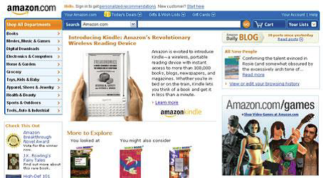
Rather than make wholesale revisions every few years, Amazon uses products, algorithms and user feedback to continuously maximize their site to improve user experience, gather data and, of course, promote the right Amazon products to the right user. This is all part of their conversion rate optimization process. Don’t believe how truly major these minor improvements can be? Remember not so long ago when the site looked more like this:

Or even this:

Continued optimization and maximization to your site can mean the difference between a visitor becoming a customer or a bounce statistic. Common usability and content issues can be tested, found, and fixed quickly and efficiently when you realize the cold, hard truth about building a website: your work is never truly done!
Conversion Maximization can identify smaller scale, major impact improvements, including:
- Providing the right content
- Improving site architecture
- Maximizing calls to action
- Designing better landing pages
- Reformatting content for scannability
- Adding clear pricing
- A/B Testing of content, forms and more
Learn more about conversion maximization, and let’s talk how we can help you identify and solve common website issues without requiring a complete redesign.
Share
Subscribe


