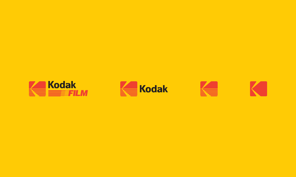
Static Logos are Dead?
The gold standard for a logo has always been rigid artwork that rarely adapts from its primary form. Designers have long created various layouts for a company’s mark from the oh-so-classic horizontal format to a vertical stack, sometimes changing the brand colors to better suit dark or light backgrounds.

The intention of a logo used to be for simpler applications such as print ads, business cards, or a store front sign. But today’s logo has to consistently work across an ever-growing list of mediums, including digital devices with a vast list of screen sizes/resolutions. Most logos aren’t designed with a responsive mindset and the mindset has been to shrink or resize to retrofit the size of the space.
But don’t fret! Static logos are still the starting point for any brand identity system and any secondary formats should retain the key visual elements that users identify with your brand. But from the very get-go of creating a visual identity, it’s crucial that your focus is keeping things dynamic.
The very best logo executions are simple and flexible with varying formats and layout options so that no matter the logo’s destination area, it can easily work within any space.
Now you might be thinking, “Wow, Thomas! What an informative blog post! While this might be super relevant for tech companies like Facebook or Youtube, but this certainly doesn’t apply to an old school law firm or the HVAC industry?”
You bet your sweet buns it does.
All industries eventually end up on the web and are affected by the plethora of various screen sizes.
As designers, we should help educate our clients to embrace this new flexible mindset, creating logos that are optimized for any size or medium while retaining brand consistency. If we don’t, you’ll end up having to alter a problematic logo on the fly to suit each individual project.
And would you look at that? Gravity just so happens to pull it all together by creating a style guide with use and applications for each logo format. We determine how and when each logo variant should be used so that users see a consistent brand identity across all mediums.

.png)
.jpeg)