I recently purchased a home and at the front end of that process, my realtor asked us something I didn’t expect. She asked us “how do you live?” before she asked us what we were looking for in a home. Frankly, she didn’t even ask the requirements I had been laboring over and filtering online searches with for months. I was surprised by the question, as are many of our clients with the questions we ask when we start wading into the waters of their website discovery.

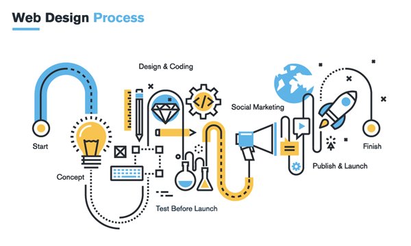
Web Design Process, Website Planning Process
You see, by nature of creating custom websites, we take a seriously deep dive in our discovery process at the front end of a website. We take the time to understand as much as we possibly can about our clients, their customers, their industry and their competitors. The reason for these questions might not be entirely apparent at first, but they’re critical for us to create a custom website that is the best possible representation of your company to your target audience.
So, much like our discovery questions, the answer to my realtor’s question didn’t really come into play until we went to see a house that met all the requirements but as we walked through the house we were nonplussed. It was in the town we wanted, had the right number of bedrooms and bathrooms, it technically had what we asked for – but it wasn’t what we wanted. With a tight market, we couldn’t be sure another house in this town would come up this year. We were weighing our options there in that mediocre kitchen. Our realtor knew after watching us walk the house, this wasn’t “the house” and she straight up told us she wouldn’t let us put an offer in on it. Why? Because it didn’t match how we lived and it wasn’t “us.”
The point of this story is that all too often we start down the road of a new website with an excited new client full of requirements for their new website and there are three roadblocks we often hit that blindside our clients. Sure, we can work around them but in the end, we can’t give them what they want – a website that’s truly theirs without these three things.
- Messaging
It’s frankly shocking how many companies do no have any messaging documents to live by or send along a logo guideline and say, “it’s all in there!”. This is the core of who you are – this is it, everything that defines your company. This is your “why” – your reason for existing. So no, we cannot create a custom website based on a listing of product features or services and expect it to miraculously represent who you are. You need to define that first. We’re happy to help you do that, but this needs to happen before we can create a visual representation of it. - Logo
No, no, no, we cannot just slap your logo on your website whenever. You can, if you want to use a theme and upload your logo yourself. But to create a custom website without your logo? It’s like making custom clothing without a body. It’s just not going to happen. It’ll be custom alright but it’s not going to be custom to the body wearing them. There is only so much we can do without your logo. Also, old logos? Please, no. Your logo and your messaging need to speak the same language. We’re not miracle workers. If you think you can slap an old out of date logo on a new website and think no one will care or notice – you’re wrong. - Product Architecture
First off, the way your business is structured internally, your product teams if you will, is not product architecture. Expect that we (and I sure hope any agency) will ask you how people buy your products and services. People need to know what and how they can buy from you and if that’s not clear, why would they take the time to find out? When your discovery phase concludes, information architecture comes next, and if you don’t know how your products and services are structured, packaged and sold - we’re dead in the water.
The moral of the story is, there is so much more to creating your website than dragging and dropping a logo, images and text. It’s an art, it’s a science, and it’s hard work. Creating a website that seems effortless is a monumental labor of love from the client, the agency, and everyone in between and it certainly doesn’t happen without messaging, a logo and your product architecture clearly defined.
In case you were wondering, we did find “the house” for us. It was the only house our realtor brought to us (not the other way around) and she called us about it on the way home from the nonstarter discussed above. We pulled off the next exit and headed back North and the moment we walked in we said, “this is it.”
Share
Subscribe


