Design 101 Understanding Pantones, CMYK & RGB
In a digitally-focused world, it’s easy to forget the subtle nuances of print. It’s understandable - websites have answered the call for brochures, one sheets, annual reports and more. But there’s still one large, important component that the internet can’t fully dictate: the brand.
When it comes to branding, color is an extremely important factor. It’s part of a company’s core identity and is expected to be distributed consistently across all mediums. Having a firm grasp on how color works in print and in the digital world is essential to keeping brands consistent. Here are a few different things to know when looking at your print marketing solutions.
PANTONES: What are they?
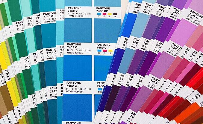
Pantones (or PMS - Pantone Matching System) are spot colors belonging to a standardized color reproduction system. This system was created to establish consistency throughout multiple printed products (paper, fabric, plastics, etc.) and throughout print shops themselves.

Before we continue, let’s talk more about spot colors. A spot color is any single pure or mixed ink color. CMYK is made up of four spot colors (Cyan, Magenta, Yellow, Key or Black). The full Pantone system is comprised of 1,114 single spot colors, which are created using thirteen base pigments. Whenever a Pantone color is used in printing, the printer needs to create the Pantone color using a PMS formula guide and the thirteen base pigments.
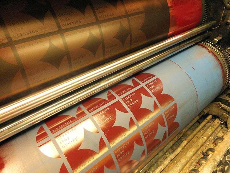
When printing with Pantones (offset printing only), a printing plate is created for each Pantone color that’s been used in the design. So if you have a design that only utilizes two Pantone colors, then two plates will be made, one for each color. Conversely, with CMYK colors, a plate needs to be made for each color (Cyan, Magenta, Yellow, Black), which are used together to create the final image.
 Selecting Pantones is easy using Pantone swatch books, but keep in mind there are several versions of Pantones. The most commonly used are Coated and Uncoated - Coated for printing on coated paper and Uncoated for printing on uncoated paper. If you look at the same Pantone color swatch side by side as Coated and Uncoated, you’ll notice a big difference in tone. You should keep this in mind when selecting Pantones for your collateral.
CMYK: It’s all about color build

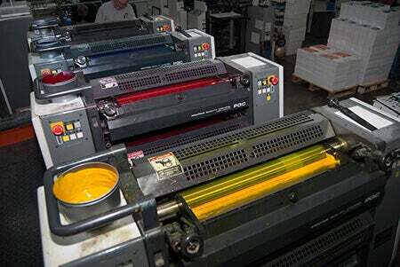
As mentioned earlier, CMYK is comprised of four spot colors: Cyan, Magenta, Yellow and Key or Black. When printing with CMYK in offset printing, four printing plates are created - one for each spot color. The final printed image is created by building the CMYK colors on top of each other.

Unlike Pantones, CMYK color can also be used when printing digitally. Digital printing is usually more cost effective and has quicker turnarounds, however this all depends on quantities and queues. Pantone inks cannot be used in digital printing and can only be utilized in offset printing.
RGB: For a paperless world

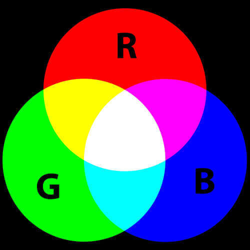
RGB, or Red, Green and Blue, is a color model that is strictly used for digital applications, ie. video, web, games, apps - anything using a television or computer monitor. RGB should NEVER be used for printing purposes.
Being a ‘device-dependent’ color model (meaning each and every device will display RGB values differently thanks to variating manufacturer elements and age), RGB is extremely inconsistent and unreliable. As a result, you should never rely on your monitor displays for accurate Pantone or CMYK color renderings. The only way to get the most accurate view of a color you’re going to print is to utilize Pantones and go to a press check.
Pros & Cons
Each colors system has his attributes and downfalls. Here are a few to keep in mind.
Pantones:
- Pro: Ideal for overall brand color consistency
- Cons: NOT consistent when printed on coated and uncoated papers, do not convert well into RGB, printing is usually more expensive
CMYK:
- Pro: Printing is usually cheaper, converts better into RGB
- Cons: Printing is almost always never consistent; varies from print shop to print shop, paper to paper, run to run
The Takeaway
Now that you know the basics of Pantone and CMYK printing, there should be three important things engrained in your mind to remember:
- You should use Pantones when creating your company’s brand because of it’s consistency over several mediums, with the exception of coated and uncoated differentiators.
- Never rely on what you see on your computer monitor for color matching
- If you’re highly concerned about perfect color consistency, always choose Pantones and always attend press checks.
Happy Printing!

.png)
.jpeg)